On most days I carry a slew of art tools with me when I am going out to sketch. You never know which tool you would be inspired to pick up that day!
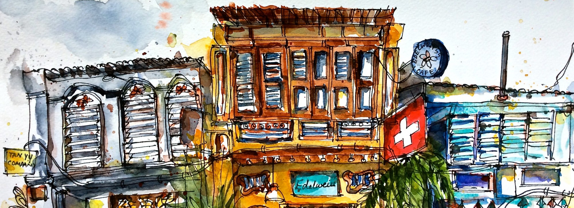
In my case, it often depends on the subject. For busy street scenes and city scapes I feel like I can express myself better using a dip pen with flex nib and ink on large sheets of paper where I have space to move my hands around to convey all the energy and chaos of that urban setting. If I am at a cafe with comfortable seating and good light, I crack open my sketchbook, spread my crayons, markers and colour pencils out on the table and play with those over a cup of tea. Inside a park or a public garden there is nothing more satisfying than sitting on the grass and rendering dense swathes of greenery with broad strokes of a flat brush loaded with transparent watercolours.
Last year however, while recovering from my shoulder injury there was a period when I had to pare down my bag of art supplies to one pencil and a single sheet of paper. I felt terribly encumbered without the rest of my tools but pressed on hoping that it won’t last long. On the contrary the whole thing turned out to be a fun challenge! The sketches below were done during that time at different cafes in my neighbourhood.
In the absence of colours, I was forced to pay attention to a very important design element i.e tonal values ( how light or dark something appears) in a way I had never done before. It was like going back to basics and focusing on a technique and getting better at that.
For a composition to look balanced and aesthetically pleasing, one has to create depths and contrasts which I realized becomes much simpler to learn and execute using a single colour. The more I practised drawing this way, the more I learnt about elements that did or did not work for my drawings. No wonder art tutors recommend practising with a pencil to get a better grasp on tonal vales and only when you have mastered that can you start using colours.
I did start using colours as soon as I could carry them out with me, but not without the learnings from this inadvertent practice session.
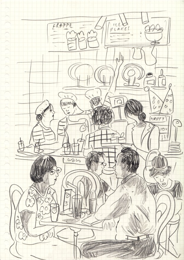
Lunch hour rush at Paris Baguette next to our apartment
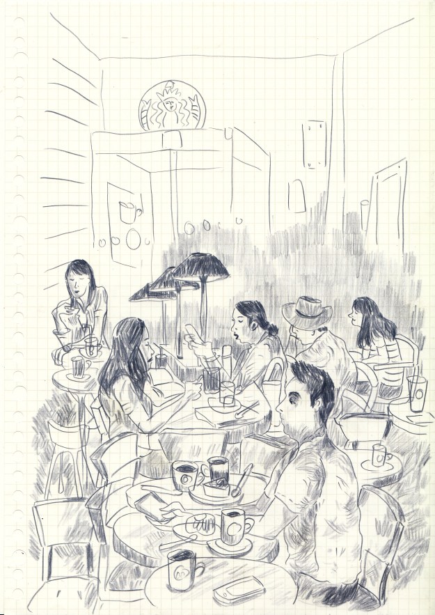
Starbucks on a Staurday evening. I used a Prismacolor indigo pencil.
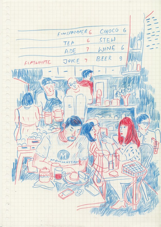
Some cafe near Seoul Forest. Drawn with a pencil with two colours on either side.

Saw this lanky biker dude with a colourful skull cap and earrings talking loudly on the phone

I’ve always found it interesting how the absence of colors forces us to pay attention to other elements. I love comparing color photos of busy areas to black and white ones. When I look at the black and white ones, they seem less… noisy because of the absence of color. I pay more attention to the shapes in the picture and the tonal values as well (thanks for teaching me a new phrase).
yes exactly! Looking at black and white photos is a great way to study tonal values actually.
Pingback: Let’s Rewind: June 2020 | Zezee with Books
I like how you used the blue and red pencil. The red really comes forward in your sketch, while the blue recedes. Do you have one of those magic multicolor pencils? I have always wanted to try one.
Hi Cora, thank you! I know what you’re talking about but it’s not the multicolour pencil, though I love it too. I used one of those bi-colour pencils that you get in stationary stores, it has one side red and the one side blue 🙂
Wow amazing drawings!! I really like your illustration style. super cool.
We are DNA Design Studio. If you have some time, it would be nice to visit our page.
There are some works you might like. Feel free to leave any feedback or comment. Thank you. 🙂
Thank you! glad you like my work 🙂 I checked out your website – awesome job with the paper toys!
I love your sketches, they show such character and movement.
Thank you so much! Glad you like my work 🙂